Side Panel Editor
Side Panel places PME Popup Dialogs or existing Blender panels in an editor’s sidebar or header. Keep the content definition separate from its placement.
This page describes PME 2.1 settings.
Configuration guide — features, combinations, and uses (for AI)
Name: Side Panel / Type ID: PANEL.
Arranges Popup Dialog contents or Blender panels as persistent UI.
Inputs: a Popup Dialog reference or Blender panel ID selected through Add Panel. One panel occupies each row. This editor does not use ordinary Command / Custom code tabs.
Placement: select Space / Region / Context / Category. Category defines the tab name, separately from the PME menu name. See placement settings.
Structure: ordinary panels and Sub-Panels belonging to the nearest ordinary panel above them. See the panel list.
Combinations: create buttons in a Popup Dialog, then choose their placement here. When regrouping existing panels, you can hide the originals with Hiding Unused Panels.
Constraints: moving a panel does not remove its actions’ Blender context requirements. Check values, operators, and display conditions when placing a panel in another editor.
Example: collect modeling Popup Dialogs in the same 3D Viewport Category, using collapsible Sub-Panels as needed. See usage patterns.
Validation: display it in the intended editor and region; test enabling/disabling the group, child panels, and actual button actions.
Interface and editing workflow
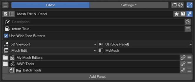 1Name and basic controlsCheck the name and enabled state of the sidebar layout.
2Advanced settingsSet the description, availability conditions, and icon button width.
3Location and categoryChoose the editor, region, context, and category in which the panels appear.
4Panels and parent relationshipsArrange the panels to display. This example includes child panels.
1Name and basic controlsCheck the name and enabled state of the sidebar layout.
2Advanced settingsSet the description, availability conditions, and icon button width.
3Location and categoryChoose the editor, region, context, and category in which the panels appear.
4Panels and parent relationshipsArrange the panels to display. This example includes child panels.
Select Side Panel in the list, configure its destination on the right, then reference content with Add Panel. See Common Editor Elements for menu list controls.
Check the name and enabled state.
Set the content references and order in the panel list.
Check the display and each button in the destination editor.
Name and basic controls
The menu name identifies this panel configuration within PME. Set the N-Panel tab name separately in Category below. Enabling registers the panels at their destination; disabling removes this configuration’s panels. See selected menu settings for names, tags, and references. This type has no Hotkey settings or preview.
Placement (Space / Region / Context / Category)
Item |
Role |
|---|---|
Space |
Destination Blender editor |
Region |
Destination within the editor. Use UI (Side Panel) for the N-Panel |
Context |
Filters by Blender panel context. Choose a value supported by the destination |
Category |
Sidebar tab name. Panels sharing a destination and Category appear in the same tab |
Context does not accept arbitrary C.mode values. Its choices come from contexts on registered Blender panels.
Use Poll to test a specific mode or selection state.
Context / Category fields are hidden when Region is Header.
Panel list
Choose a PME Popup Dialog or existing Blender panel through Add Panel. Edit a Popup Dialog’s buttons and properties at its source. Here, set the panel label, order, and parent–child relationships.
Control |
Role |
|---|---|
Panel/folder icon on the left |
Switches between an ordinary panel and Sub-Panel |
Label |
Edits the displayed panel name |
Open reference button |
Opens the corresponding Popup Dialog for editing |
Row menu |
Sub-Panel, Add Panel, Move Panel, Remove |
Sub-Panel
Making any row except the first a Sub-Panel assigns it to the nearest ordinary panel above it. Adding another ordinary panel makes subsequent Sub-Panels its children. The first row cannot be a Sub-Panel. This structure supports one child level beneath ordinary panels; Sub-Panels cannot have further nested children.
        flowchart TD
    A["Category: My Tools"] --> B["Panel: Modeling"]
    B --> C["Sub-Panel: Selection"]
    B --> D["Sub-Panel: Modifiers"]
    A --> E["Panel: View"]
Check parent and child visibility and expansion at the actual destination.
Advanced settings
Open these with the gear button. See the shared advanced settings for Description and Poll. Poll determines the contexts in which this panel configuration is available.
Use Wide Icon Buttons gives icon-only controls wider buttons. It does not stretch the icon artwork horizontally.
Usage patterns and conditions to check
Create your own N-Panel tab
Prepare a Popup Dialog, set Space to 3D View and Region to UI (Side Panel), then enter the desired tab name in Category. Add the dialog with Add Panel and check it in the 3D Viewport sidebar. Multiple Side Panels using the same Category appear in the same tab.
Vary visibility by mode or state
Write the visibility condition in Poll—for example, whether an active object exists or the mode is Mesh Edit. Check both panel visibility and whether its operators can run in that context.
Regroup existing panels
Use Add Panel’s Blender panel selector or Interactive Panels. Moving an existing panel alone can leave it without values or conditions it expects from its original editor. Start with one panel at a time and check both value display and editing.